



















Creative Ways to Present Data in PowerPoint
- Effective presentations combine data visualization with storytelling to make complex information accessible.
- Select the appropriate chart type and design method based on the data you are handling, audience requirements, and presentation objectives.
- A smart AI presentation generator can show you the best way to automatically structure and present data in PowerPoint, leading to better decision-making and engagement.
- Eliminate unnecessary visual elements to enable audiences to focus on data presentations.
- Gradually reveal information to assist listeners in understanding complicated data sets.
The presentation of your data has the power to fascinate or confuse your audience. Adapting your PowerPoint presentation to the exact sort of data you’re working with is something we’ll cover in this article.
How to Present Data in PowerPoint Effectively
It is a common error for presenters to assume that the data will speak for itself. But without background, analysis, and plan, not even the most crucial results matter.

More work than just pasting spreadsheets onto slides is required when presenting data. Make sure your audience knows not just what the numbers mean, but also why it matters and what they can do about it. Mastering the fundamentals of data presentation in PowerPoint will allow you to transform your raw data into presentations that educate, convince, and motivate your audience to take action.
Start with Your Core Message
Before launching AI PowerPoint presentation software or any other data visualization tool, consider the following question: “What would I want my audience to remember about this data, should they only remember one thing?” All column charts, graphs, and visual elements must help you drive home your message.
Take every piece of data as a stepping stone in your argument, transforming your presentation into a strategic communication tool. If you are interested, we also have an article about impactful business presentation ideas that will allow you to start thinking outside the box.
Select the Appropriate Data Visualization for Your Type of Data
Various types of data require various visualization methods. Time series naturally lend themselves to line charts, whereas bar charts are best suited for comparisons between categories. Pie charts or donut charts are great for proportions and percentages, but they should be used sparingly because they may be hard to interpret when there are different categories.

Scatter plots or bubble charts can be used to demonstrate the relationships between two or more variables. Geographic data benefits from color-coded maps. The idea is to align the visualization with the natural structure of the data, to make patterns instantly apparent to your audience.
Tell the Story with Your Data
Each dataset has a storyline. Organize your data presentation like this:
- starting point (context and baseline),
- middle (the data and what it reveals),
- end (implications and recommendations).
Use techniques from storytelling to build suspense and then resolve it. In order to present solutions backed by additional data, you must first identify a problem with your data and then understand its impact. Use this narrative technique to create presentations that will captivate your audience and leave a lasting impression of your research.
Narration is a powerful tool for presenters who want to make the most of the information they have to offer.
Minimise Difficult Datasets
Data in its raw form might be intimidating, but it is your responsibility to simplify it so that your audience can grasp it. If you want to make your argument, cut all the fluff and focus on the essentials.
Start with a single slide that covers the basics, and only then go into further depth on the slides that follow. Those that need extensive information will get it in a way that doesn’t annoy the rest of your audience.
Carefully Place Excel Spreadsheets
Is there a way to import Excel data into PowerPoint? If you’re giving a live presentation with potentially changing data, you can guarantee that your charts are reflecting the most current information by connecting them to the source.
To avoid technological issues after delivery, make sure these links are active and validate any embedded parts beforehand.
Maintain a Consistent Approach to Design
Consistency in appearance fosters confidence and comprehension. Create a colour palette that reflects your brand’s aesthetic and stick to it throughout your presentation. To draw attention to important data points or patterns, use colour.
Ensure that all elements of your presentation, including font sizes, chart styles, and spacing, are consistent. With no need to adjust to different graphic forms on each slide, your audience is free to focus on the material itself thanks to this consistency.
Display Findings from Data Analysis
When presenting analytical findings, briefly describe your methodology before drawing conclusions. Important or startling results should be captioned.

Moreover, prepare slides that summarize several data points. Decision-makers like it when you have already done the interpretive work, translating analysis into strategic recommendations.
Manage Financial Data Points with Precision
Financial presentations require precision and clarity. Apply consistent currency formatting, clearly label fiscal periods, and provide comparison points (year-over-year, quarter-over-quarter) to provide content.
While PowerPoint is ideal for high-level financial summaries, if your data needs to be organized into a comprehensive, high-volume inventory format, our AI ppt platform can instantly generate multi-page, print-ready documents that bridge the gap between presentations and reports.
Benefit from Visualising Demographic Data
Presentations on demographics can benefit from the usage of pyramid charts, geographical maps, and segmentation diagrams. You can learn more about your market or audience by combining demographic information with data on their behaviour or preferences.
When using PowerPoint, how can one best display demographic data? Use symbols and pictures with charts to make demographic numbers more relatable. Your data will become more relatable if you accomplish this. Consider a pie chart depicting the distribution of ages and try to pair it with images or symbols representing the different age groups.
Provide Real-World Examples to Put Numbers in Perspective
To make high figures or rising percentages more intelligible, it is helpful to put them in real-world situations. Human narratives give data personality. When paired with a single straightforward customer success story, the statement “73% of customers report satisfaction” becomes more compelling.
The greatest part about these translations is that they make it possible for audiences who aren’t technically savvy to grasp the big picture without resorting to mental arithmetic.
Make the Most of Qualitative Data Visualisation
Not all information is numerical. There has to be a shift in presenting strategies for qualitative data interpretations derived from interviews, surveys, or case studies. Enclose pertinent client comments in quotation marks. Another way to see recurring ideas from free-form replies is with a word cloud.
The best way to use PowerPoint to showcase qualitative data? Arrange the qualitative data according to different themes or categories. Visual hierarchies aid in the understanding of numerical data and the navigation of abstract ideas.
The Power of PowerPoint for Data Visualisation
Presentations that make data more visually appealing and accessible are what modern audiences demand. Consider these strategies for making better use of data in presentations.
Methods for Creating a PowerPoint Display of Data Trends
It is recommended to use solid lines for trend lines and dashed lines for future forecasts. By highlighting this distinction, viewers are better able to distinguish between proven and forecasted data.
In comparisons, a few of trend lines will do the trick, but no more than three or four will be too cluttered. To draw attention to the most important trend, you should use line weight and colour strategically.
Get the hang of complex chart types
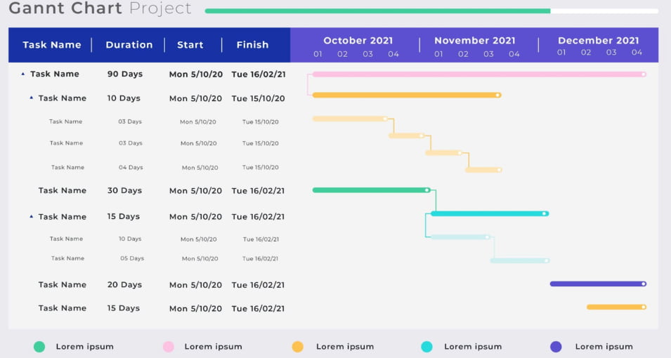
Data visualisations can range from the most basic bar and line charts to more complex ones that show complex relationships. Project timeframes and dependencies are shown using Gantt charts. In big data environments, heat maps are employed to show patterns in data by intensifying colours. For the purpose of visualising sales funnels or conversion processes, funnel charts are utilised.
Sankey diagrams indicate flow and distribution, making them ideal for budget allocations or customer journey mapping. It’s one of the best ways to provide a lot of information in a clear and concise manner.
Best Practices in PowerPoint Data Presentation
Even though you have learned data visualization fundamentals and the main techniques, minor design faults can still sabotage your delivery. The tips below will alert you against:
- losing the attention of the audience in the middle of your presentation;
- animation that doesn’t add any value to your presentation deck;
- slides that look fantastic on laptops but not on big screens.
In fact, effective presentation of data in PowerPoint presentations requires complete mastery of both technical and communication skills. Find out more about why presentation skills are important by simply reading our article.
Direct Attention to Key Results Right Away
Save your viewers the trouble of digging for the answers. Highlight significant data with color contrast, size fluctuation, or motion to bring attention to it. Title your insights with descriptive language that conveys what they are.
Swap out “Q4 Sales by Region” with “Western Region Met Sales Targets by 23% in Q4”. To put it another way, this is how you make your case.
Be Strategic in Your Animation Use
Show data gradually with animation, and control the audience’s attention as you develop complicated charts little by little. To draw attention to certain information over time, highlight specific data points using subtle motion effects.
See How It Looks on Various Screens
Data presentations sometimes fall flat because the conference room screens aren’t as good as your laptop. Consequently, gradually enlarge the font size. Streamline charts and test them in different settings to ensure colour selections are legible.
Prior to beginning your data presentation, consider these five questions.
5 Questions to Ask Before You Start Your Data Presentation
It is strongly recommended that you prepare a strategy in advance of your presentation. Try to answer the following questions first.
What Choice Is Informed by This Data Set?
Having well-defined goals will help you save time and provide better results. Would you like to see a rise in funding? Would you like to prove the program’s success in order to get more money? On the other hand, are you interested in pinpointing the issues that require resolution?
Your data presentation needs to make the connection between data and decisions very obvious. Try refining your approach to deliver practical insights the next time your presentation fails to sway a particular result.
What’s Your Target Audience and What Are They Interested In?
CFOs are concerned with financial implications, whereas operations teams care about efficiency metrics. Marketing leaders would like to view market research results, and technical teams need a presentation that gives them technical implementation knowledge.
Present your data in a way that matters to the audience. The same data may produce three different types of data presentation based on the audience you’re addressing. If you are into sales, for example, you can read our blog post on how to make a sales presentation.
What’s the Right Level of Detail?
Too much data may overwhelm your listeners, but insufficient data won’t convince them. Strike a balance without overloading them with information. Ensure that you’re aware of the level of expertise of your audience. Executive presentations require top-level information with details in appendices. Methodological depth in the presentation itself may be appreciated by technical audiences.

Get some in-depth slides ready that you may cover or omit based on the queries from the audience. This adaptability demonstrates thoroughness while yet meeting time restrictions.
Is There a Priority for Specific Comparisons?
From a bar chart on the left and various pieces of data on the right, what can be derived? Only when contrasted strategically can abstract numbers be relevant. Growth from one year to the next, achievement of goals, comparison to competitors, or before-and-after metrics all provide the essential context.
Pick analogies that drive home your thesis. Be sure to include the baseline you used for your study if you’re exhibiting any progress. Make sure to compare the predicted returns on investment possibilities when you’re using PowerPoint to show facts and justify investment.
How Are You Going to Respond to a Question About Methodology?
Data analysts will likely ask you questions regarding your data sources, sample sizes, and analysis methods. Always be ready to explain concepts like margin of error, statistical significance, or confidence intervals.
Instead of hoping no one will notice, you should take the initiative to acknowledge data gaps and limitations. Your genuineness makes you dependable and thoughtful.
Stakeholders and Executives Can Benefit from Modern Data Presentation Methods
When the stakes are high, you need to use advanced approaches that show that you can think strategically and analytically. We should start by looking into them.
Create Layouts for Executive Dashboards
Similar to business intelligence tools, dashboard designs compile a number of relevant metrics and present them on a single screen. Organise key performance indicators (KPIs) in a sensible manner, use uniform formats for comparable metrics, and highlight red flags.
A good dashboard will have arrows pointing up or down to show trends, and metrics to compare current data to that of the previous period or to a goal.
Create Frameworks for Comparing Scenarios
Use parallel comparisons that assess each scenario on comparable criteria when presenting alternatives. The use of matrix layouts
- scenarios as columns,
- evaluation criteria as rows,
- graphical displays of what option performs best in each dimension.
By making trade-offs explicit and comparable, this systematic methodology makes data use in decision-making easier. Users are able to swiftly determine which solutions are better thanks to colour labelling.
Virtual and Mixed-User Audience Development
These days, it’s not uncommon for data presentations to cater to both online and in-person audiences. Make your presentation materials more suitable for screen sharing by adjusting the contrast and text size to your liking.

Make sure the data is understood for sure by taking breaks so the remote audience may raise questions and think about employing polling or reaction features.
Benefit from AI-Powered Design Automation
Critical meetings no longer necessitate the use of pricey presentation designers or the tedious manual manipulation of PowerPoint templates. You can skip the design process entirely by utilising Decksy, the top AI presentation generator on the market, to quickly go from raw data to a deck that is ready for the boardroom.
Innovative Data Presentation Strategies to Meet Your Goals
Just because you’re presenting analytical results, demographic data, or financial predictions doesn’t change the fundamental idea. That is, connecting knowledge to action, good data presentations simplify complex information. Make sure that your final goal is the driving force behind all data visualisation choices, colour schemes, and layout selections.
Presentations with high stakes can be won or lost with the help of intelligent AI design automation. Your investment in a robust AI generator will be more than recouped in the amount of engagement, message retention, and business outcomes you get in a matter of seconds rather than days.
FAQ
Data embedding in PowerPoint: how to do it?
You can either directly insert charts using Insert > Chart or paste the data as an image. Alternatively, you may use the Create from File option under Insert > Object to import whole Excel files. In contrast, go to Paste > Paste Link > Microsoft Excel Worksheet Object to get an instantly updated live link.
How can I make the most of PowerPoint to show data?
Using the correct charts is key to the most successful approach. In other words, you need to choose a data visualisation type that works with your data structure and makes complicated information easier to understand. And don’t forget to knot all the
How can I use PowerPoint to show my data analysis?
Start with the methods and primary results, and then provide supporting evidence in the form of comprehensive charts and data visualisations. Provide context by annotating findings. The next step in turning your study into practical suggestions is to create summary slides that will encapsulate your findings. Keep in mind that viewers can better follow your analytical process when you disclose information gradually.
If you were to present financial data, what mistakes would you see most often?
The most common mistakes we see are charts that are too complicated, inconsistent formatting, and no justifications for large differences. So, what is the best way to use PowerPoint to display financial data? While dashboard-like designs are great for giving a bird’s-eye view of the financial situation, showing how different elements contributed to changes, waterfall charts are great for showing how different factors contributed to overall changes.

Sarah Michelle Carter is the Chief Human Resources Officer at Decksy, and the person most likely to remind you that a company's culture is built in the small decisions, not the mission statement on the wall. She's pragmatic about AI — not an evangelist, not a skeptic, just someone who's watched it quietly clear out the repetitive parts of the job so there's more room for judgment and attention. Known for asking better questions than she answers, she's a go-to voice on culture, leadership, and where AI genuinely helps teams versus where it gets in the way.