
















Templates
Data Analysis presentation template
We use a presentation template for data analysis to help us clearly organize, visualize, and explain insights from our data. Our goal is to guide us through the story of what the data shows, what it means, and what actions we should take.
Generate similar 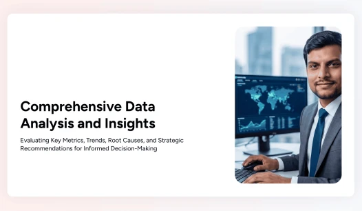
Data Analysis Presentation Template Preview
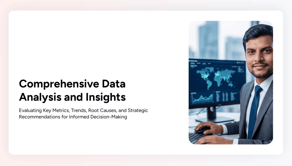
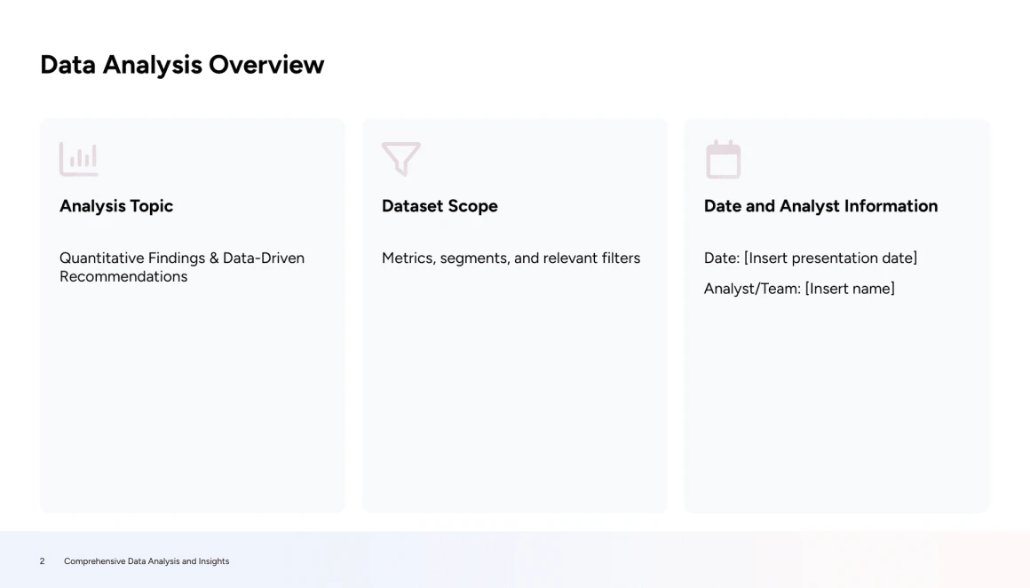
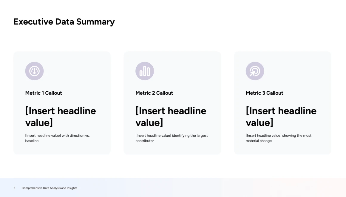
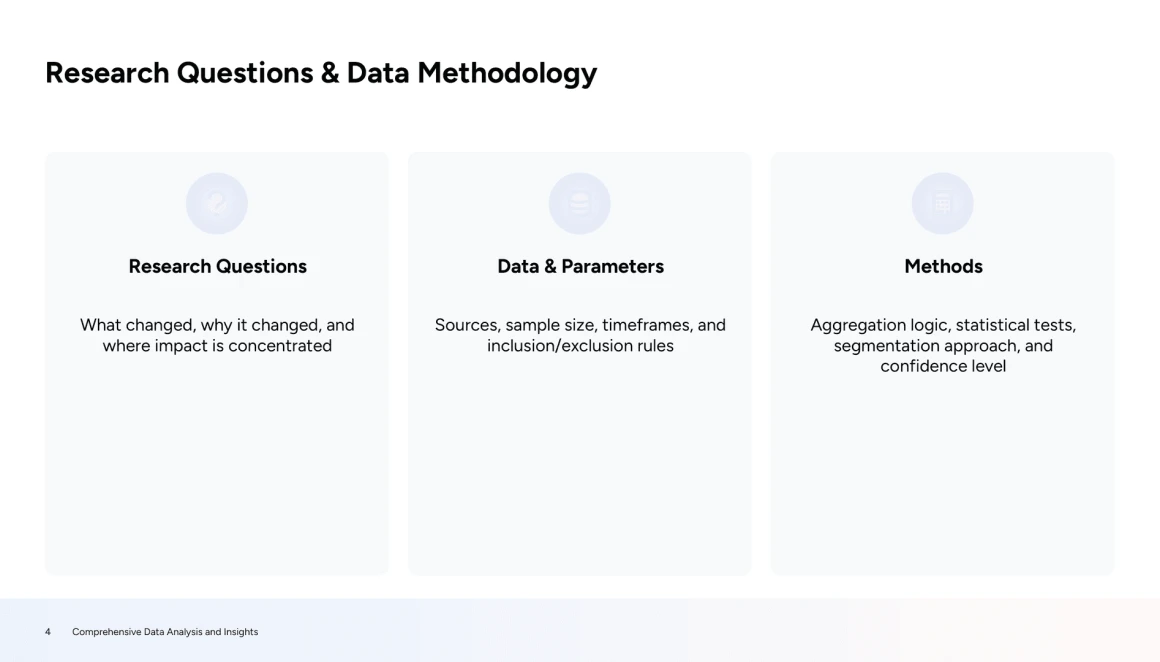
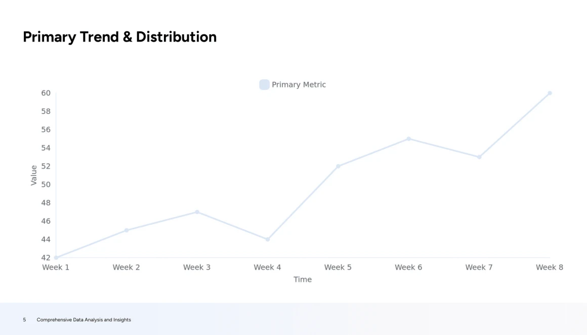
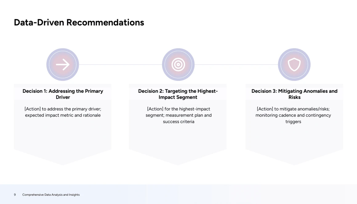
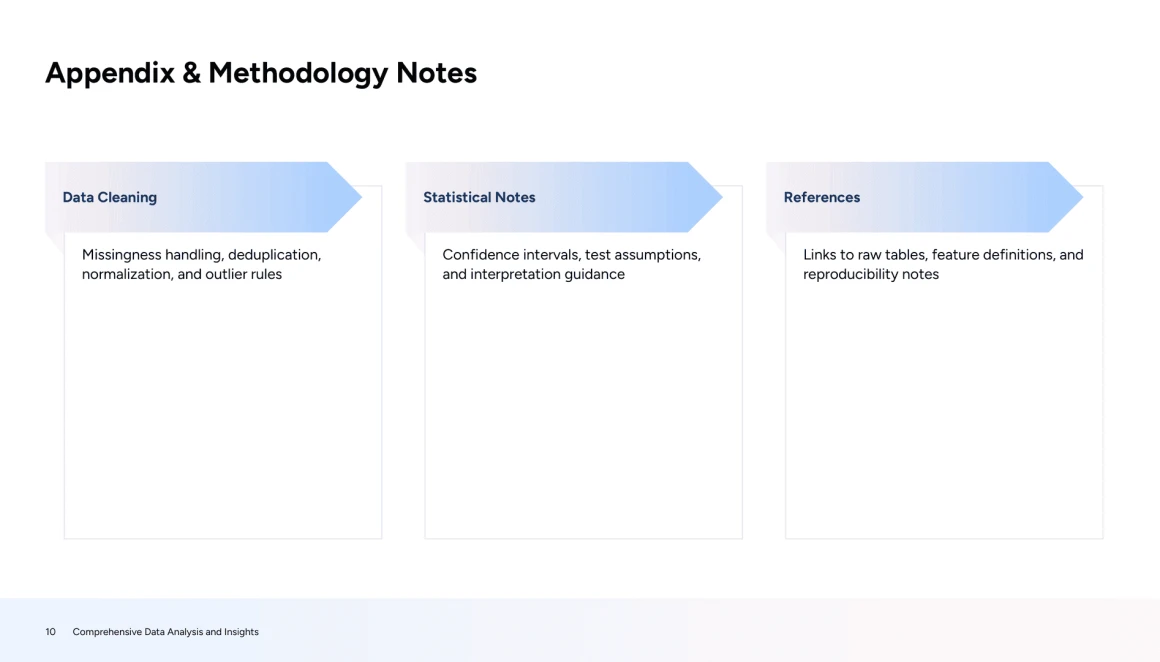

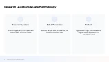
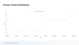
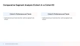

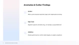
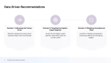
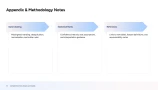
Download data analysis presentation template




This Data Analysis Presentation Template was created with the AI report presentation maker to give analysts, data scientists, and BI professionals a clear, repeatable way to present findings from complex projects, particularly those involving business metrics, experimentation results, and forecasting. It’s intended for people who need to communicate results to mixed audiences such as executives, product managers, and cross-functional stakeholders who may not be fluent in SQL, Python, or statistical terminology, but still need to understand what the data shows and what actions to take. The template is designed to organize the end-to-end story of an analysis: it helps structure the problem and business goal, define key metrics and data sources, summarize methodology (e.g., how data was cleaned, what models or analyses were used, and why), present results in a decision-friendly way (trends, segment comparisons, cohort performance, model accuracy or lift, and experiment outcomes), and then translate those results into insights and next steps (recommendations, risks, limitations, assumptions, and follow-up work). By standardizing where each of these elements lives, the template solves the common problem of inconsistent, overly technical decks that either bury the “so what” or omit critical context, leading to confusion, stalled decision-making, and repeated explanations. Instead of reinventing the narrative every time, users can quickly produce presentations that are both rigorous and easy to follow, ensuring stakeholders understand the evidence, confidence level, and recommended actions.

Decksy’s AI transformed the topic and raw source material into a polished data analysis presentation by organizing the content into a clear narrative flow, moving from problem framing to data insights, using consistent slide layouts and section structure. It applied a clean visual treatment (uniform typography, chart-ready spacing, and purposeful use of graphics) so complex information like methodologies, metrics, and findings could be compared at a glance rather than read line-by-line. The result is a practical, ready-to-present deck template that makes your analyses easier to understand and reuse, with well-labeled figures and digestible summaries tailored to this data analysis presentation topic.
Explore Post-Data Insights
Decksy makes your data insights instantly visual.
Skip the complex design skills and tedious formatting, Decksy’s AI handles the visual heavy lifting for you. In seconds, it transforms your raw metrics into a polished analytics story, instantly styling data layouts, organizing insights, and creating clear, chart-ready visuals.